Why does a website look fine but still fail to bring enquiries?
A polished design alone is not enough. When a site is unclear, slow, or weak on trust signals, visitors leave without acting even if the visuals feel respectable at first glance.
The usual problem is not one thing
When a website is underperforming, people often blame the design in a very general way. In practice, most weak websites are failing because several small problems stack together: the offer is not clear enough, trust is too thin, the path to action is vague, and the site feels slower or heavier than it should.
What visitors are deciding very quickly
- What does this business actually do?
- Does it look credible enough to trust?
- Is this relevant to me right now?
- What should I do next if I am interested?
1. The offer is not clear enough
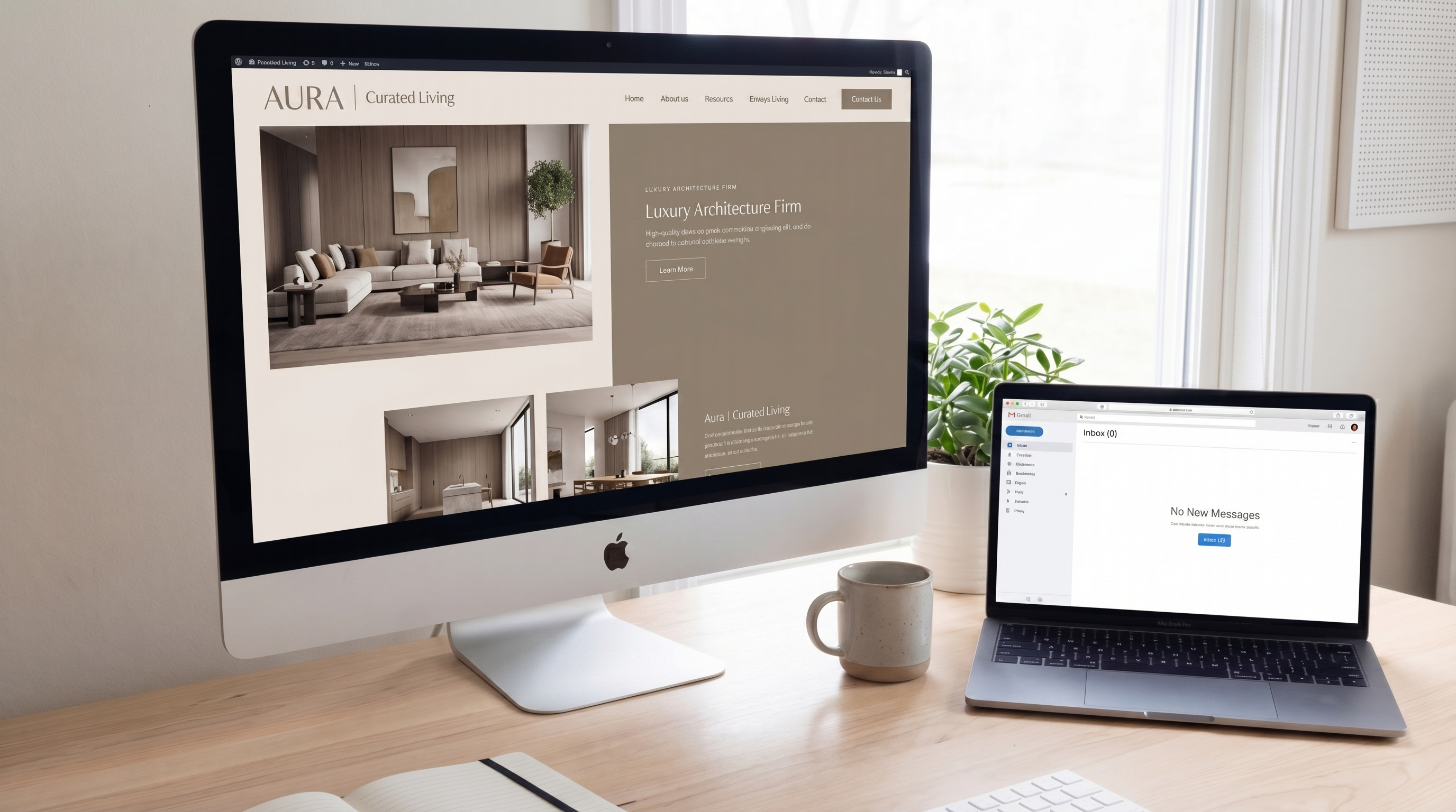
If the homepage headline is too abstract, or the opening section does not explain the business quickly, people have to work to understand it. Most will not. A site usually performs better when the first screen states the offer in direct terms and supports it with a clear next step.
2. Trust is too weak
Trust does not come only from testimonials. It also comes from structure, tone, consistency, pricing clarity, contact visibility, and the sense that a real professional is behind the work. A site can look elegant and still feel uncertain if these signals are missing.
Simple trust signals that help
- Clear contact paths and a real name or business identity
- Selected work or concrete examples
- Direct language instead of vague marketing phrases
- Structured pricing references or clear project starting points
3. The page does not guide the visitor well
A website needs hierarchy. If everything has the same visual weight, the user does not know what matters. The page should guide attention from headline to offer to proof to action, not leave everything competing at once.
| Weak page pattern | Stronger page pattern |
|---|---|
| Abstract headline with no practical meaning | Direct opening that states the offer clearly |
| Generic CTA like "Learn more" everywhere | One stronger next step such as "Get a quote" or "Send a message" |
| No proof until much later | Examples, reassurance, or credibility cues near the top |
4. Speed and mobile friction are quietly hurting the result
Visitors are less patient than most businesses expect. If the page loads slowly, jumps around, or feels heavy on mobile, fewer people stay long enough to enquire. Speed is not only a technical metric. It directly shapes whether the site feels competent and easy to use.
5. The next step is too weak
Some sites explain the business reasonably well, but then they become hesitant. The user reaches the bottom without a strong reason to act. If the project path is vague, or the contact invitation feels heavy, people postpone the decision and often disappear.
What usually improves conversion first
- A clearer first-screen message
- Stronger visual hierarchy across the page
- Cleaner trust signals
- Faster, lighter mobile behavior
- A more direct call to action
Final thought
If a website looks decent but is not generating enough enquiries, the answer is usually not "start over completely" and it is rarely "change one button color." The real improvement often comes from tightening the message, the structure, the proof, and the overall feeling of trust.
If you want a second opinion on what is hurting the site most, you can send the current website or the page you are worried about and I can point out the clearest improvement area to start with.